


ROLE
Product Designer
TEAM
Era, Nishat and me
PLATFORM
iOS / Android
STATUS
Shipped, Aug 2024
BACKGROUND
You open it and it tells you what the air is like where you’re standing.
Ambee is an environmental intelligence company. Most of what it sells goes out through APIs, to businesses who build their own products on top of the data. The app is the one place where the same data gets pointed at a person instead of a developer.
I was a beginner when this started. I had moved from engineering into product design and this was my second or third project. Era was the senior product designer and Nishat was the UX designer, and Era put me on this so I could get hands-on experience with visual design and UX.

Air quality, pollen and weather on the home screen
THE PROBLEM
Making climate data readable inside a loud visual language.
The app that existed before this was fine. It wasn’t bad. There were a lot of numbers on it, and vector art to indicate things, whether it was sunny, or whether the air quality was high.
The direction we went with was neo-brutalism. That was Era’s call, argued in a pitch that used CRED’s neopop as proof the style could work for a mass audience. Bold typography, heavy black outlines, clashing colours, high contrast.
That creates a problem for this kind of product. In a neo-brutalist system colour is loud by default, because that is the style. But in a climate app the colour is also carrying the reading, whether the air is clean or moderate or high or hazardous, and most people will look at the colour and never look at the number underneath it.
So colour had to do two things at the same time. It had to be loud enough to hold the style, and accurate enough that somebody could act on it.

The same page at five readings, clean to hazardous
WHO USED IT
Two sets of people had to read it.
Designers and developers building the app. The design side and the mobile team both worked off it, so it had to be readable from both. Somebody building a new screen shouldn’t have to decide from scratch what high pollen looks like.
People using the app. Somebody opens the app, reads a colour, and decides whether to go out.
THE TEXTURE SYSTEM
This is the part I like most, and it isn’t in the app any more.
There were two patterns. A wave pattern and a dot pattern. The wave pattern meant air quality and the dot pattern meant pollen, so you knew which one you were looking at before reading anything.
The background colour of the pattern changed with the reading. On air quality, clean air was blue, moderate was yellow, high was red, and hazardous was purple. On the pollen side the same thing, mild pollen was yellow and high pollen was magenta.
So the shape told you which dataset it was and the colour told you how bad it was.

Dots for pollen, waves for air quality
COMPONENTS
The foundations were already there when I joined. I built on top of that.
The parts I spent the most time on were the data components on the location detail page. Air quality, temperature, UV, wind direction and wind speed for a specific location. And the dot patterns, which took the longest of anything.
43
component sets
306
variants
100
variables
84
styles
A lot of that is the ordinary stuff, buttons and cards and inputs, navigation, bottom sheets, search. The icons are laid out as matrices, with rows for the type and columns for the size, so Essentials is 13 types across 4 sizes and Weather is 11 across 4.


Cards, inputs and controls, icons, buttons
FOUNDATIONS
Colour, type, stroke and shadow.
01 Colour. The scales run 50 to 500 instead of 50 to 900. It’s a neo-brutalist app, so that many steps wouldn’t have meant anything, and we needed two adjacent steps to be visibly different.
02 Typography. Inconsolata for headers only, Sofia Pro for everything else.
03 Stroke. 1.2, 1.5, 1.8, 2, 2.2 and 2.5px. Most systems don’t have a stroke scale. We used it for the borders and also for the double height shadows, so keeping it as one scale made more sense than defining it twice.
04 Shadows and corners. Single and double shadows at x2 y2, x4 y4 and x6 y6. Corner radii 10, 13, 16 and 20px.

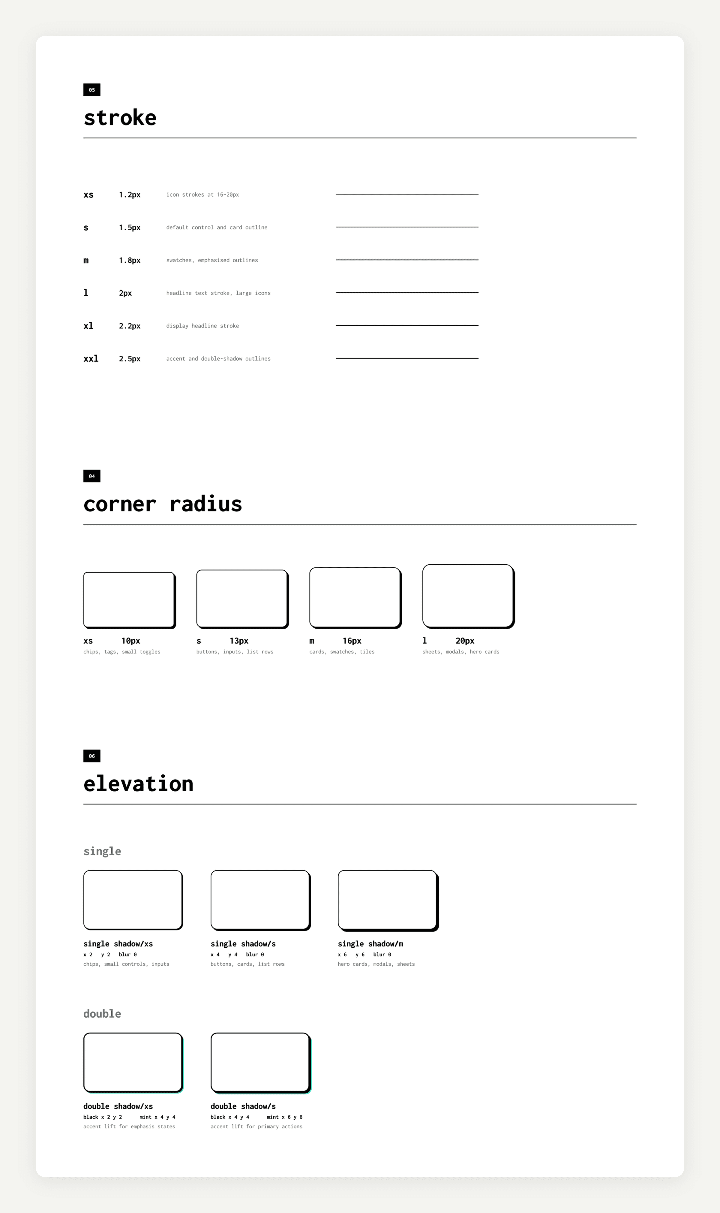

Colour, type, and stroke, radius and shadow
WHEN THE MAP CAME IN
The colour decision came later, when we had to add the map.
Once the map came in we had to follow the USEPA guidelines for the colours so it wouldn’t mismatch the standard. We tried it first with the colours that already existed on the app. We put them on a real map at around 75% opacity and it was looking a little bluish, so we had to change the colours from blue to green.
Nobody really pushed back on that. We just had to follow the guidelines.

Palette options tried on the map
The basemap. I had thought that if we put a colourful map and then one more layer of heatmap on top of it, the heatmap would not look significant. So instead we went with a black and white base map, and put the colourful heatmap on top of that.

The final palette, on a black and white base
Temperature on the cards. On the map the temperature scale has fourteen steps. On the app cards we brought it down to two, because it was much easier for the user to read. Anything from below zero up to fifteen degrees is blue, and anything from sixteen up past thirty is red.
We set it there based on irritation. Generally when people feel hot, or feel irritated by the weather, it’s usually above sixteen degrees. So that’s where we put the line.

Fourteen weather steps on the map, two on the cards
WHY THE TEXTURE CAME OFF
Once the page had all three on it, there was nothing for the pattern to mean.
The app has one detail page now that holds all the information, pollen and air quality and weather together. Whichever card you tap, you land on that page and everything is on it.
The texture was clashing with that page. The whole point of the pattern was that a wave meant air quality and a dot meant pollen, so we removed it.
The same thing happened on the homepage earlier. It started out showing one location, so the pattern could come from the data at your current location. Then it had to list the saved locations too, and once it’s a list there’s no single canvas to run a texture across.
HANDOFF
We asked the developers to use neopop, CRED’s library.
It had a lot of what we needed already solved, page transitions and button behaviour, and it was the reference point for the whole direction anyway. Instead of specifying all of it from scratch we could lean on something that existed and spend the time on the parts specific to us, which was mostly the data side.
I really like the button animation that came from it, the way the buttons go inside to mimic actual buttons.
Not everything came out the way we intended. The wave and the dot patterns were meant to have a parallax effect, so when the user scrolled the pattern moved with it. That didn’t get built.
HOW IT ENDED
The last things we added were the pollution and weather features, and a progressive onboarding tutorial. We needed the onboarding because the layout was fairly general, so users had to be shown where things were, where the pollen was, where the activity was, how to switch from pollen forecast to weather forecast.

Progressive onboarding, one of the last things we shipped
After that our project manager left and nobody picked the project up. There have been no updates since August 2024.
I still like the way we did the app and how we presented things.
TAKEAWAYS
What I took from it.
→ Where to use a stroke and where not to use one. A lot of the skills went into polishing the visual design.
→ How to maintain a design system, which I hadn’t done before.
→ Even with heavy strokes and shadows that can be overwhelming, how to use them decisively.