MAPS
DESKTOP
MOBILE
Redesigning a climate data explorer to be map-first, accessible and built for scale.
Visit live website

ROLE
Visual Designer
TIMELINE
Feb 2024 to Jun 2025
TEAM
Nishat, Era, Janith and engineering
SKILLS
Visual design, component systems, responsive design, design QA
PLATFORM
Desktop, tablet and mobile
STATUS
Live
OVERVIEW
WHAT I WALKED INTO
A live product, a set of wireframes and a design system. None of it blank, none of it finished.
WHAT I DID
Explored my way to a layout, including two directions I added and then took back out myself.
WHERE IT LANDED
3.4K to 15K active users, and the map the sales team opens when they’re showing a customer the data.

CONTEXT
Ambee Maps shows air quality, pollen, wildfires and natural disasters on one interactive map, anywhere in the world. You search a location, read the air quality index and what it means for your health, expand it for the individual pollutants, and play back the last 48 hours as a moving heatmap.
It is free for anyone to open, and it doubles as the product Ambee’s sales team puts on screen when they’re showing a customer what the data can do.
WHERE I CAME IN
Maps was already live and already worked…
…but it didn’t look like a map product.
Maps was already live. Nishat had already worked out the structure and most of the awkward cases. Ambee Light, our design system, already existed and had been built for Ambee’s other products.
What was missing was the version that worked.
The live product treated the map as one widget among several. It sat inside a rounded container with margins on all four sides. A panel down the right held location details, recommendations and a promotional block permanently, and a timeline ran the full width of the bottom whether or not anyone was playing anything back. Roughly half the screen went to interface before a single data point loaded, and the roadmap already had wildfires and ten categories of natural disaster queued up behind air quality and pollen.

The map is a card, not the page
It sits inside a rounded container with margins on all four sides.
The side panel never leaves
Location details, recommendations and a promo block hold the right side permanently.
The timeline owns the bottom
Full width, always open, even when nobody is playing anything back.
WHAT WE LOOKED AT
We weren’t the first people to put air quality on a map.
The brief named seven products to study: Airly, IQAir, PlumeLabs, Breezometer, Clarity, Earth Nullschool and Elichens. Most of them are air quality first. Breezometer was the closest to what Maps was trying to become, and it’s the one the brief pointed at most often.
WHAT WE TOOK
Fire icons sitting directly on the heatmap alongside air quality, rather than as a separate layer. That came from Breezometer and it’s written into the brief that way.
WHAT WE LEFT
Breezometer also changed its health recommendation as you scrubbed back through historical data. That sat in an early draft of the scope and was struck out before design started.
WHERE WE ENDED UP DIFFERENT
Maps carries air quality, three pollen types, wildfires and ten categories of natural disaster on one surface. The reference set was mostly built around a single dataset, so most of the layout problems in this case study came from carrying four.
ITERATIONS
This is most of the job, and it’s the part I like.
Nobody handed me the answer and I didn’t reason my way to one. I drew a lot of versions, put them next to each other, and worked out what was wrong with each.
EXPLORATION 1 · THE FULL-WIDTH TIMELINE
The wireframe had playback as a small card in the bottom left corner. My version stretched it across the whole screen.

It read like a video player, which felt right at the time, and it took the entire bottom edge of a product whose only real content is the map. Mine to add, mine to take back out.
REMOVED · IT TOOK THE ENTIRE BOTTOM EDGE
EXPLORATION 2 · THE DARK NAVIGATION BAR

A solid bar across the top gave the page structure and cut a stripe out of the map to do it. Also mine, also removed. Two reversals in, the rule for the rest of the project was obvious: anything permanent has to earn the space it takes from the map.
REMOVED · IT COST A BAND OF THE MAP
EXPLORATION 3 · THE DOCKED PANEL

A full height rail claims the same space whether there are six pollutant readings or none at all. Turning it into a card that sizes to its own content is what made every empty and partial state possible. Shown here as the wireframe, where the docked panel originated.
REPLACED BY A CARD THAT SIZES TO ITS CONTENT
EXPLORATION 4 · FIVE VERSIONS OF ONE CARD

Corner radius, shadow depth, and the play button as filled, outline or tinted. Same content five times, on one artboard, because it’s faster to decide when you can see them together.
SHIPPED · TINTED PLAY BUTTON, SOFTER SHADOW
EXPLORATION 5 · FIVE VERSIONS OF THE PLAYBACK STATE

Sparkline moved around, value and timestamp swapped left and right, pause and stop paired different ways. The requirement was already written: no location shows time, a selected location shows the last 48 hours. Knowing the rule didn’t make the form obvious.
The one that shipped puts the value top left, the timestamp top right, the trend underneath and the controls below.
SHIPPED · VALUE LEFT, TIMESTAMP RIGHT, TREND BELOW
WHERE IT LANDED
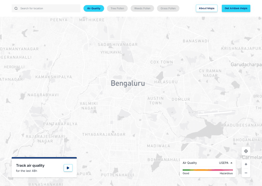
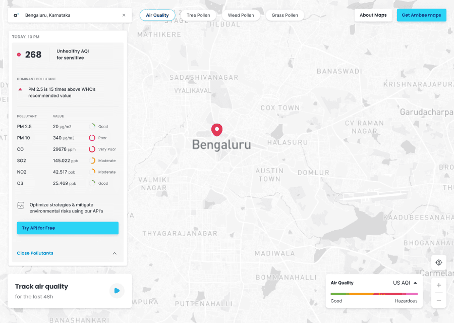
The side panel became a card. The navigation bar became four separate controls floating over the map. The timeline only opens when you play something.
THE INFORMATION CARD
It leads with the AQI and what it means, and the six pollutant readings sit behind View Pollutants for anyone who wants them. It sizes itself to whatever data exists.

THE TIMELINE CARD
Playback lives in a small card in the corner instead of a bar across the screen. With no location selected it shows time moving, and picking a location fills in the last 48 hours for that place underneath.


THE PART YOU DON’T GET TO EXPLORE
Some of it isn’t exploring. Some of it is just covering every case.
Some locations have no data. Some have half. Numbers change length, status labels run to two lines, and three countries measure air quality on three different scales.
So the pieces were built as sets of states rather than single screens. Search has six. Information cards have seven. About forty across the product.
The small ones counted too. Hovering a row in a list and hovering the text inside it are two different states. An ongoing fire and a newly detected one are two different states.

Interaction states across filters, buttons, the scale picker and the mobile category menu.
Five screen sizes
On smaller screens the filter categories collapse into an overflow menu. The timeline becomes a bottom sheet. Location details expand instead of sitting open. The menu goes full screen instead of half.
Mobile was drawn on its own artboards next to desktop, not squeezed down from it afterwards.

iPad, 1133 x 743. Everything stays visible, spacing tightens.

1024 x 600. There isn’t room for four filter categories and a search field, so the categories collapse into an overflow menu.
THEN THEY ADDED DISASTERS
Which is the same job again. A new feature for a product that already exists.
Wildfires came first, then ten kinds of natural disaster from earthquakes to landslides, with Janith drawing the icon set. My part was working out where events sit on the map, what happens when you select one, and how all of that fits into a card originally built for air quality readings.
All of it went into the components we already had, same cards, same lists, same behaviour, so nothing needed rebuilding.


GETTING IT BUILT
Designs went to engineering across four sprints. After each one I went through the build and sent corrections back.
Spacing, text styles, the menu opening full screen instead of half, the fire icon moving next to the location name. Small things, and the difference between a design and a product.
HOW DO YOU SHOW A STATUS LABEL THERE’S NO ROOM FOR?
You don’t. The air quality scale has a level called Satisfactory, the card couldn’t fit it, and the product renamed it to Fine.
HOW DO YOU KEEP THE LEGEND MATCHING THE MAP?
You can’t, quite. A transparent layer sits over the tiles to fix the zigzag edges between them, and it shifts the gradient slightly. The legend and the map are close but never exact. It went into the spec as a known exception rather than getting fixed.
OUTCOME
The day it went live, Maddy (CTO) and Akshay (COO) sent this.


A non-designer describing a UX outcome without being asked. That’s the one that stuck.

That growth isn’t down to the redesign alone. Other things were changing at the same time and we weren’t tracking conversions properly, so it reads better as usage than as proof.
This is still live. You can open it right now at maps.getambee.com
WHAT I TOOK FROM IT
The answer was in the versions, not the thinking.
Both directions I had to undo were mine, and drawing them was the only way to find that out. Five variants on one artboard settles an argument faster than one variant and a discussion about it.
Handing off isn’t finishing.
Four sprints, and after each one I went through the build and sent corrections back. The final screen is one of about forty. The other thirty nine were the actual job.
IT’S A TEAM EFFORT
Huge thanks to Nishat for the UX and the wireframes. Era reviewed the work and kept the direction honest through most of it. Janith drew the natural disaster icon set. And the engineering team, who built all of it and put up with a very long list of spacing corrections.